In black and white and in blue.
The font looks tech like so i chose it.
The logos are basically tools with the word lci tech.
Its simple.
I couldn't really think of anything else.


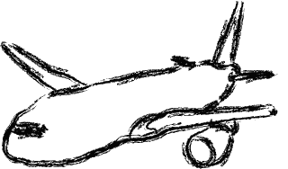
 To do this tracing, I first chosed the pen tool and started tracing around the plane. I first did the outline of the plane and then started to get on the details. I didnt do so well on the plane windows, I don't know why but thats the best I could. It's my first vector drawing, so I guess I did alright. Below is my freehand form of the same plane. I first chose the paintbrush tool to get started and then draw the plane. First I thought it was freehand so I just randomly draw something that looks like the same plane. But then I found out I need to make it neater. So this is neatest I can get. Both pictures took me a while but I believe the first one took longer and I had to do it twice since my drive somehow got wiped out.